Design Narrative
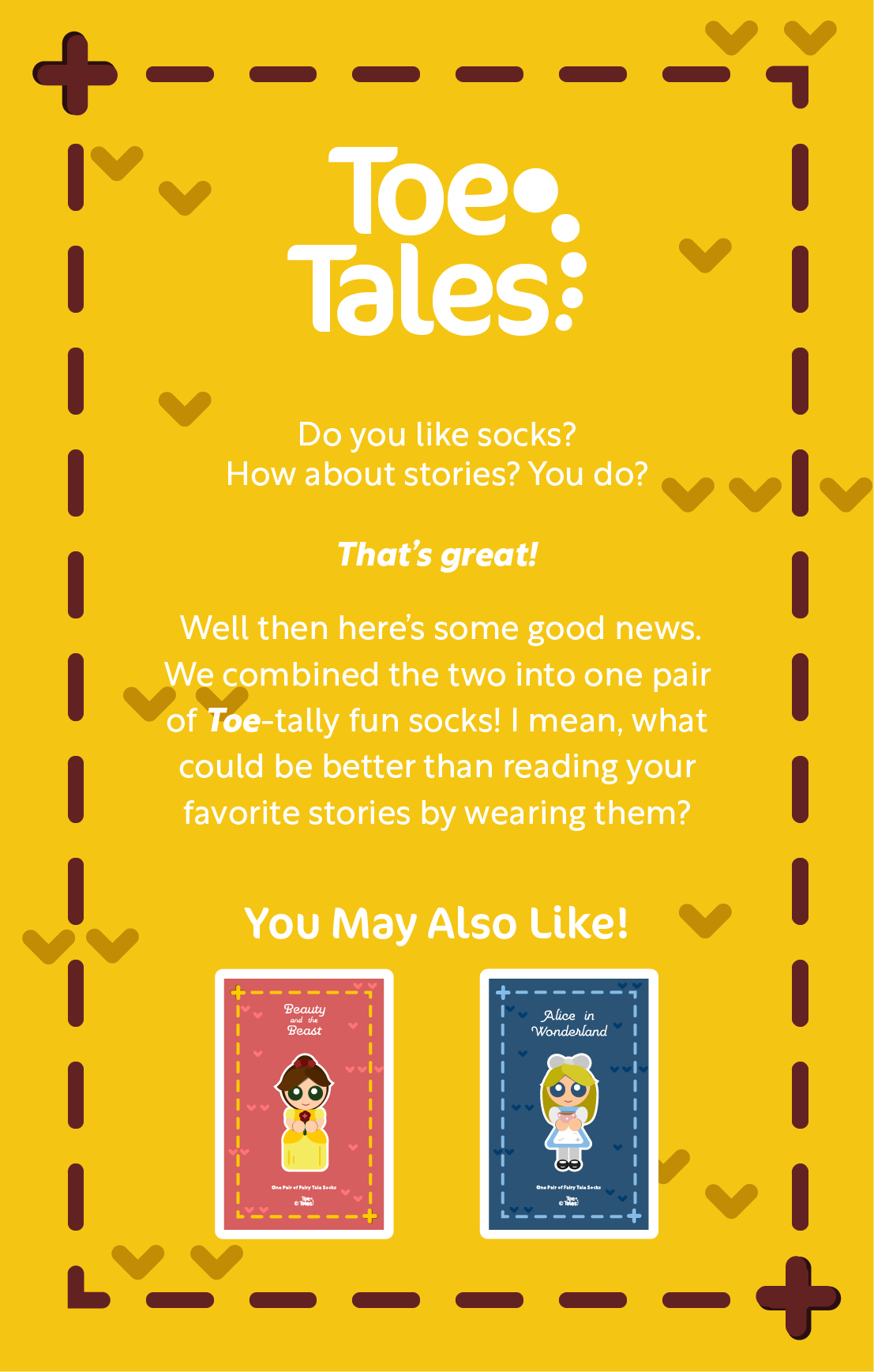
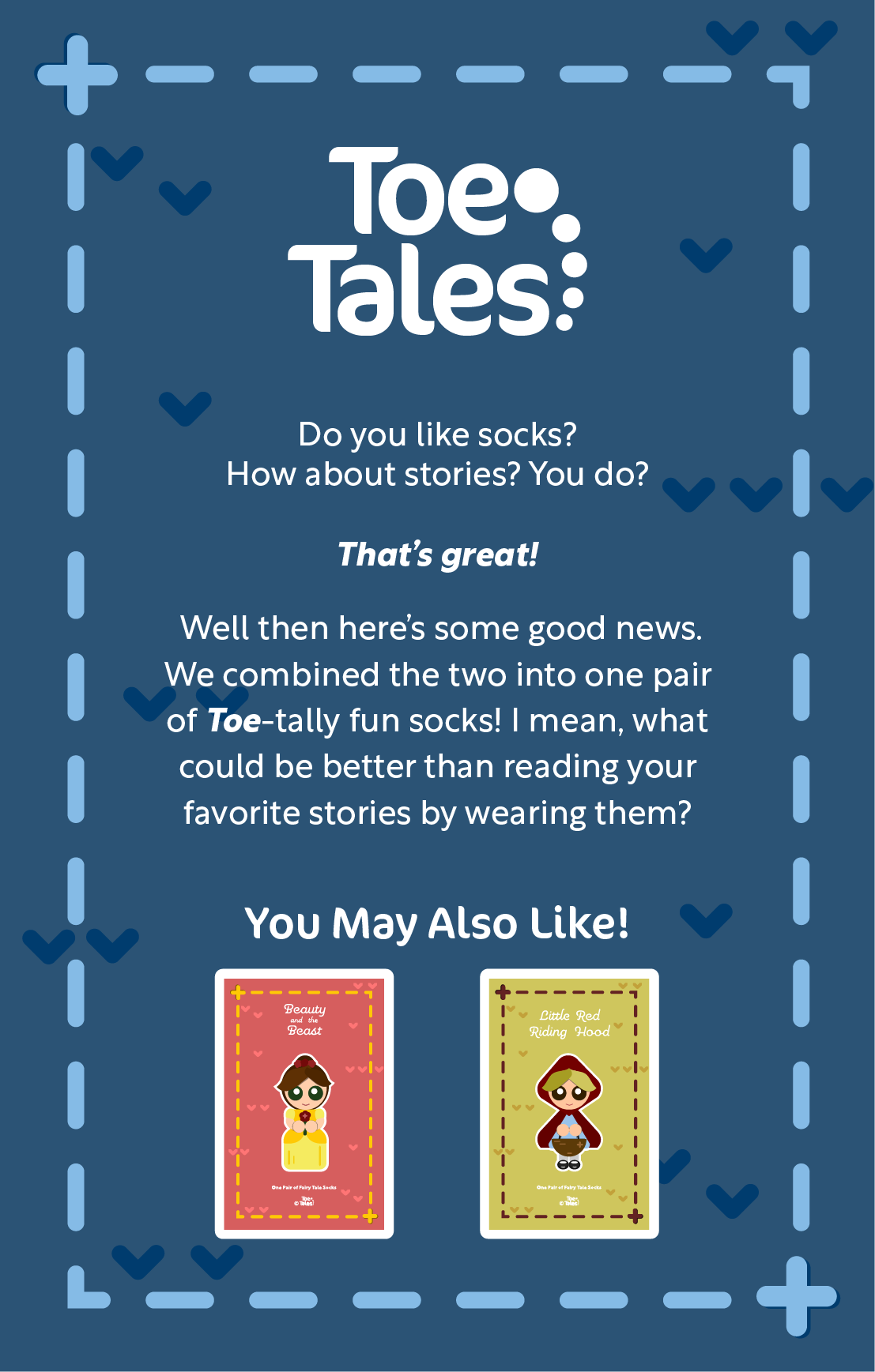
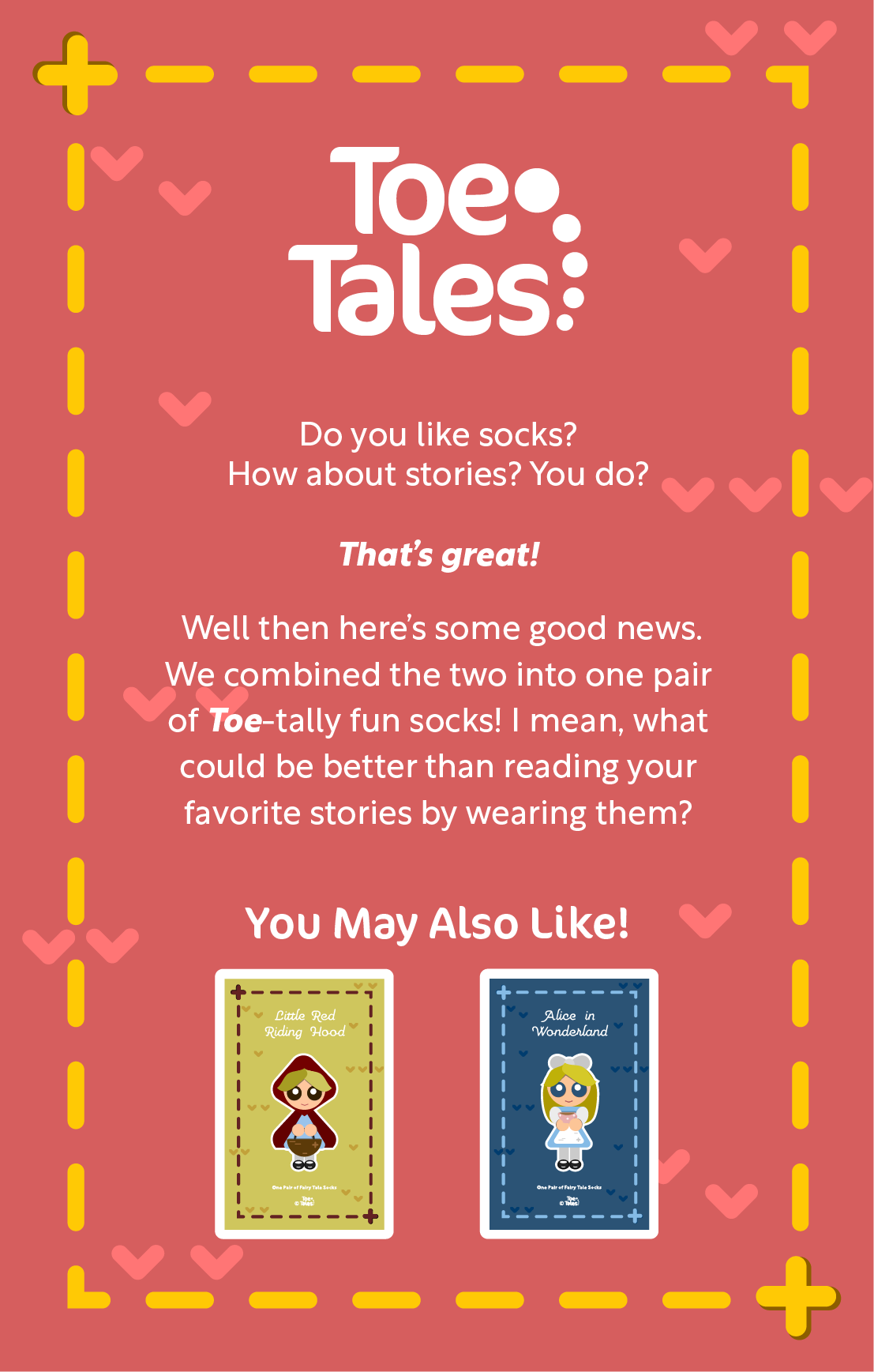
Toe Tales is a hypothetical sock company transforming stories from classic to modern stories into wearable books. The challenge revolving around the logo was being usable across all their genres of socks. To achieve this the logo is designed to reflect its fun and playful nature while maintaining a simplistic style. Taking from the name of the company, experimentation into abstraction began. Ultimately, five circles in a curved line from biggest to smallest became the answer from the icon. These circles serve as connectors between “toe” and “tales” while also symbolizing the different genres of story socks. To complement the rounded geometric shapes, a thick san serif font was chosen. For body copy a thinner serif and sans serif fonts are used on the packaging.
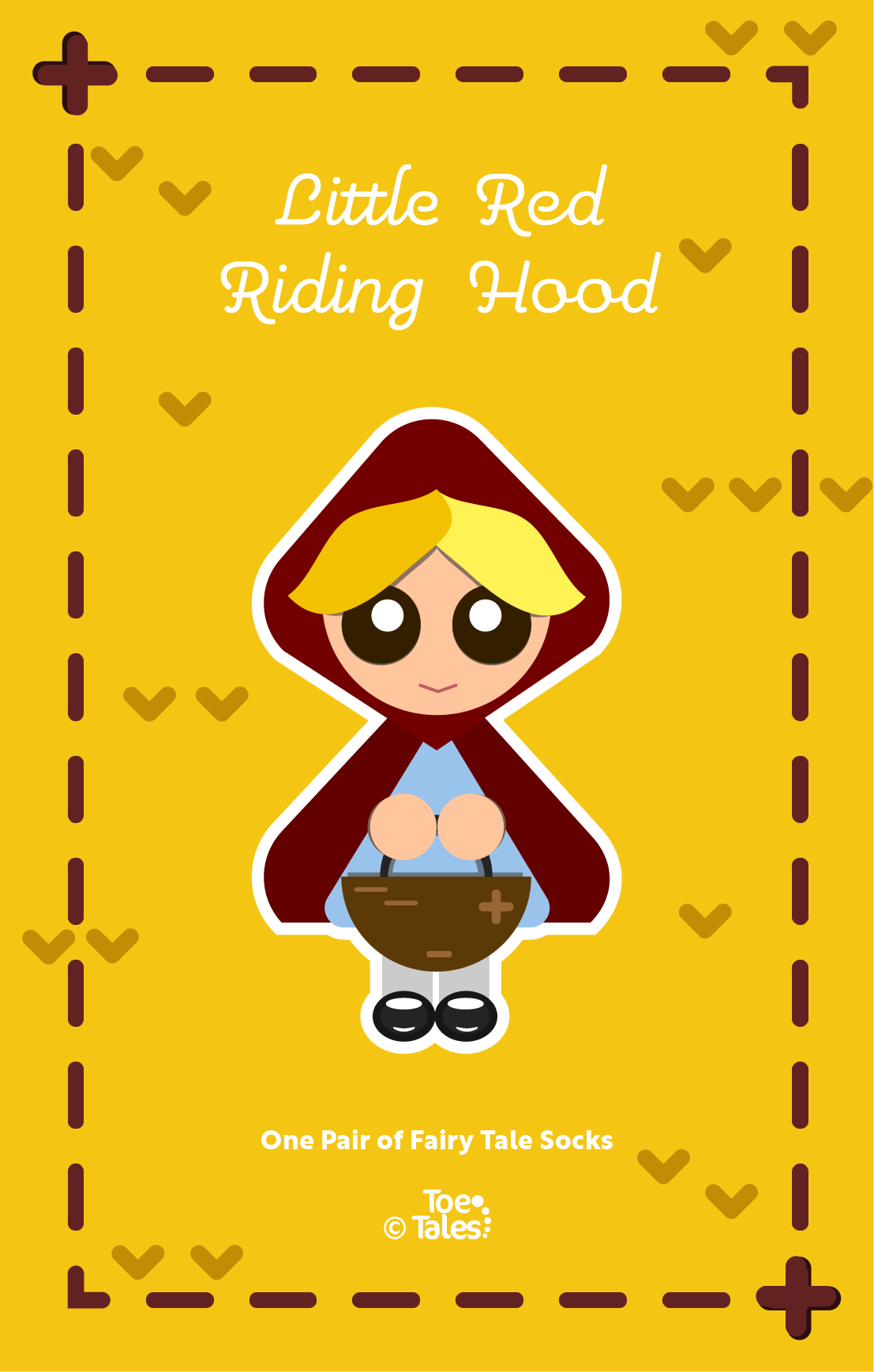
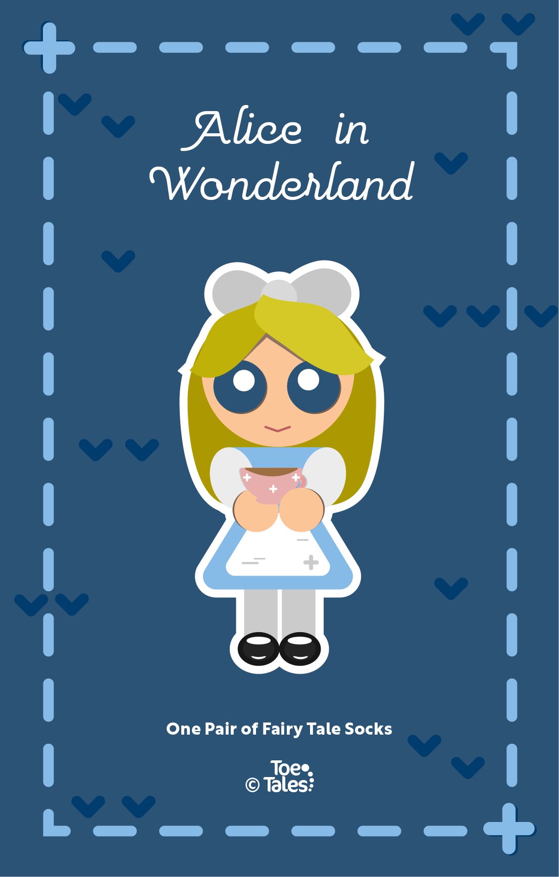
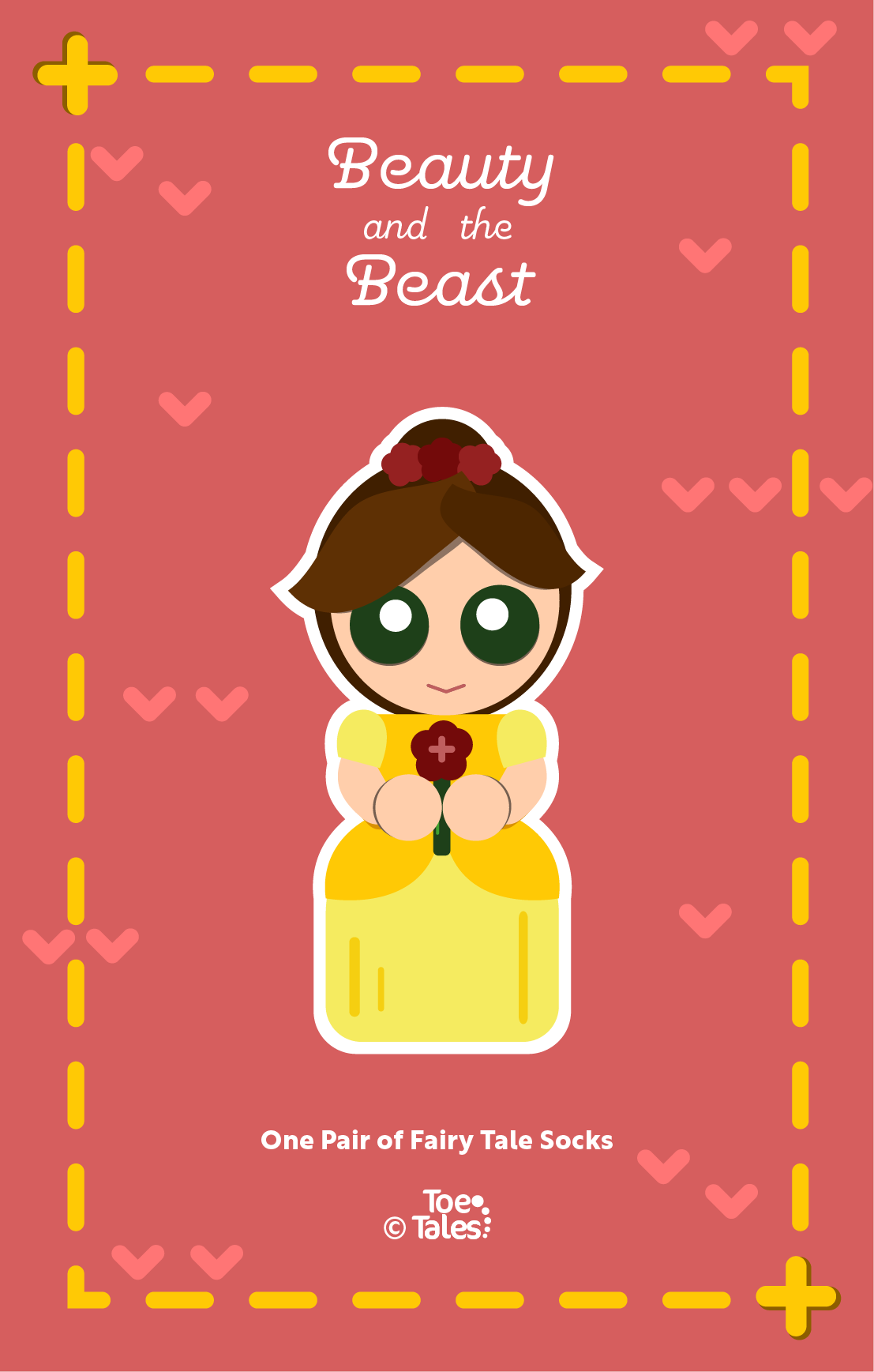
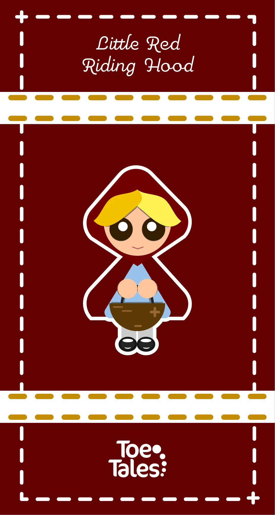
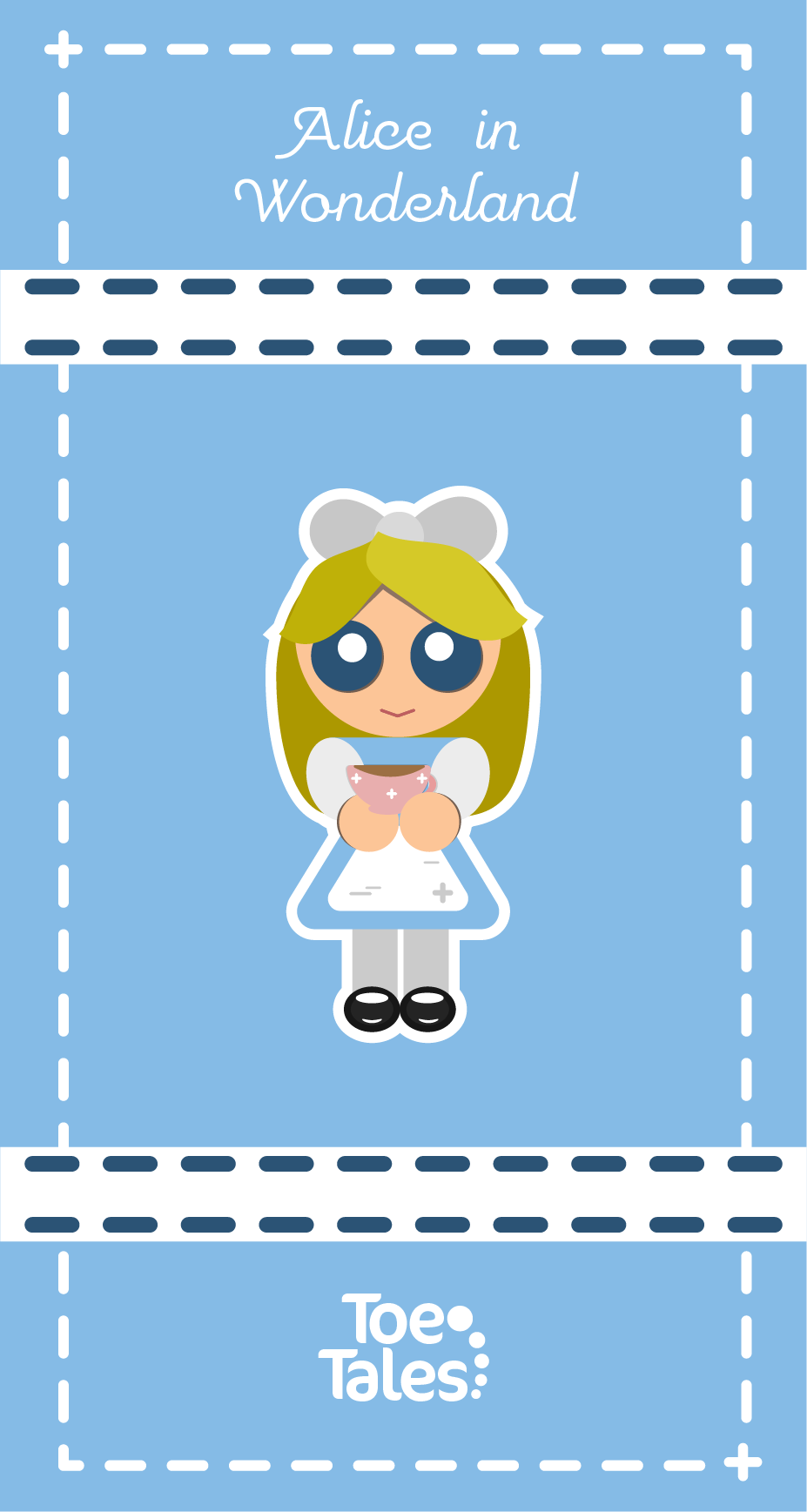
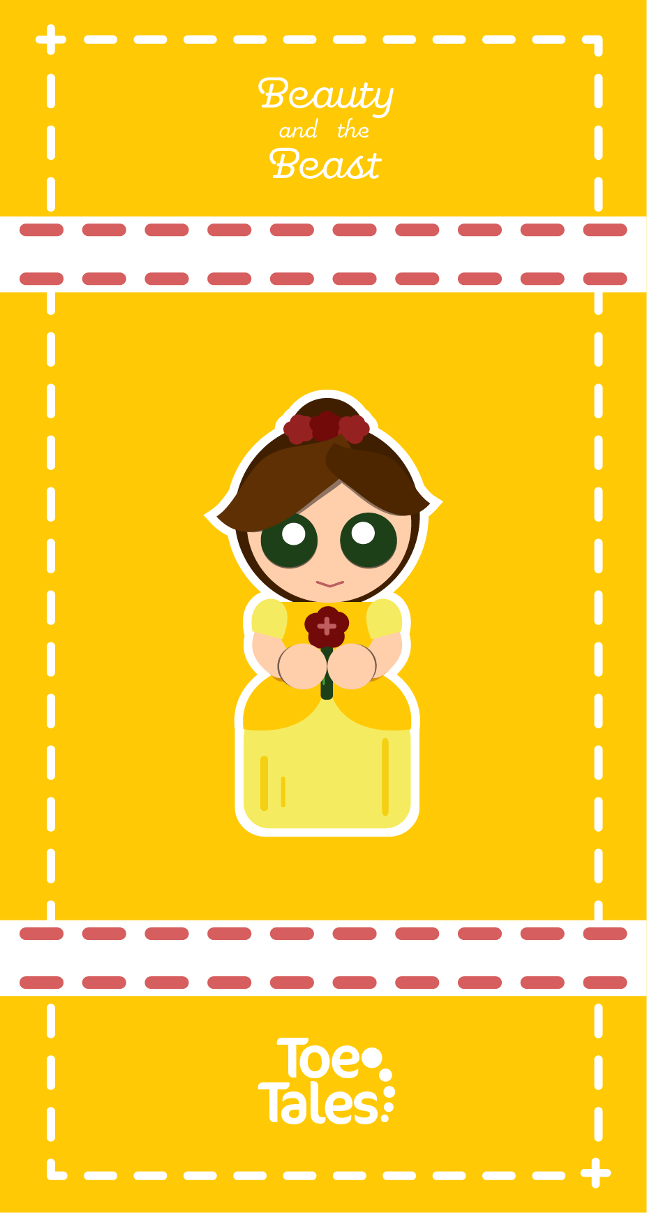
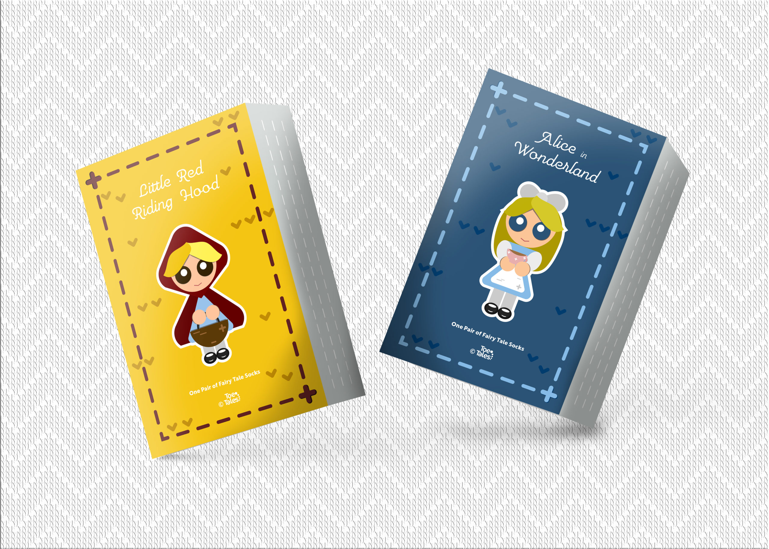
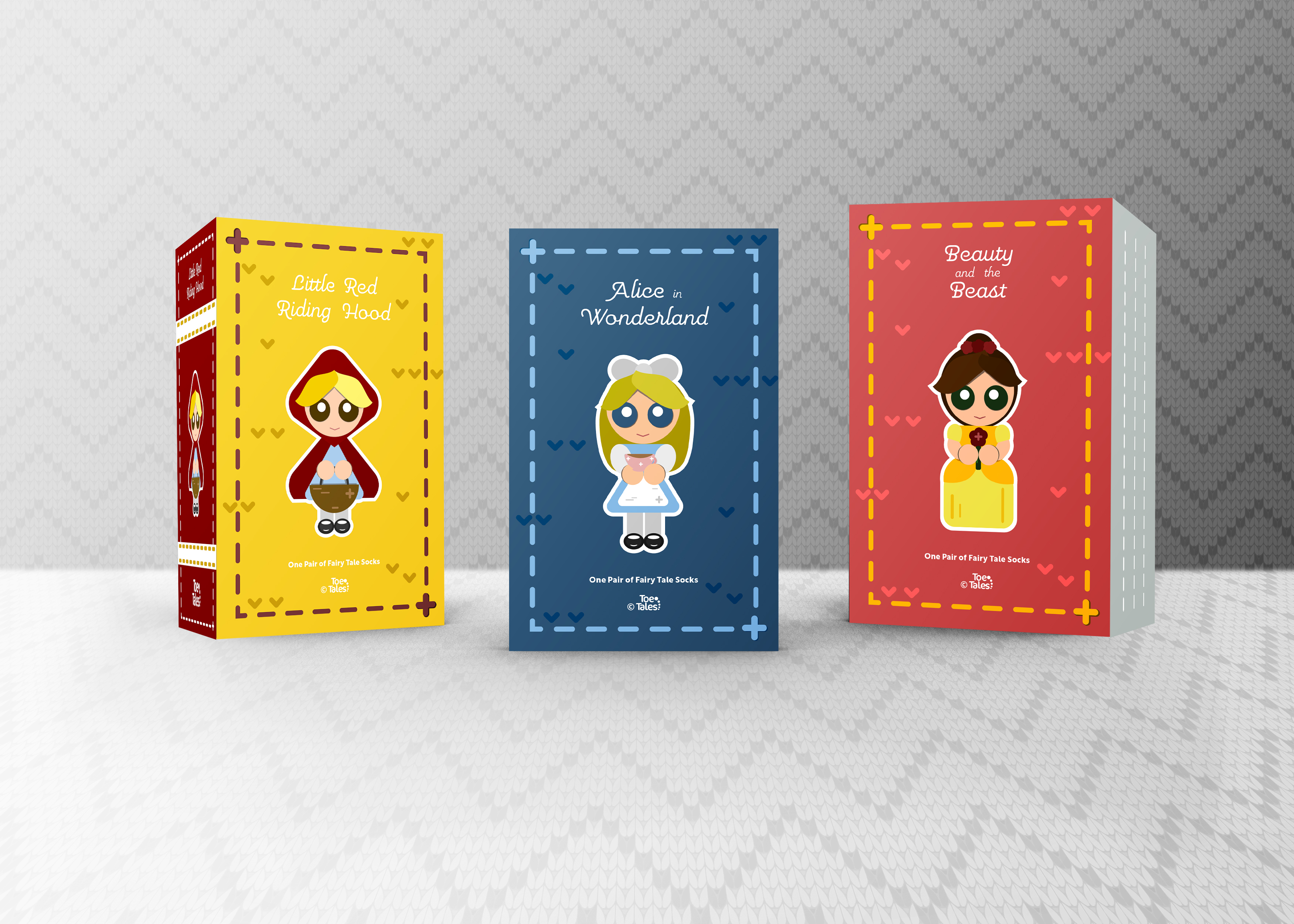
The packaging itself is designed to resemble classic books, with a unique twist – a woven texture that ties in with the socks. The packaging also incorporates details such as thread stitching and yarn textures, further emphasizing the connection between the socks and the stories they represent. To add to the fun aspect, little woven fabric doll caricatures of the main characters of the stories with complementing colors. Overall, Toe Tales is a company that combines storytelling with fashion, resulting in a unique and enjoyable experience for its customers young and old.
